Improving the "send a gift"
feature adoption.
PRODUCT DESIGN
TIMELINE
November 2023
THE TEAM
Solo Designer & Product Manager
MY ROLE
Lead Designer - IA, UX wireframes,
Customer Interviews, Visual Designs
Teeela is an e-commerce toy application that serves customers in the MENA region. Teeela provides a large selection of thousands of toys, with customised and personalised gifting options including bespoke wrapping and last-minute ordering. With super-fast, same-day delivery and an average time from order to handover of just four hours, Teeela provides a uniquely fast and seamless experience.
Introduction
My Role
I conducted stakeholder interviews, interviewed users, moderated usability tests, synthesised research results into insights, authored a report, and presented findings to our client. I created a high fidelity prototype deliverable based on research.
Understanding
Requirements
Interviewing
Stakeholder
Understanding
User POV’S
new Designs

engineering
review
user
Testing
MVP


Studying current
design
Identify gaps in designs


Client Interview
To kick off the project, I collaborated with a PM to interview Teeela stakeholders. I designed this meeting to:
1
Understand our client’s business goals and challenges with their recent launch.
2
Learn what they know about their customers and what knowledge gaps they might have.
3
Gain insight on their product direction to create alignment with design goals for the project.
“we just don’t know why users are not using this feature.
Please figure it out”
Business POV
My first step was to go through the app myself. I downloaded the app, went through onboarding, used send gift feature, and looked at information screens that were built into the app. While going through these user flows, I used Nielsen’s 10 heuristic principles to gauge what is working well, and what is not, and identify some main points of friction.
Key insights from audit
Usability Tests
User Interviews
Research Objectives
To evaluate the experience of send a gift.
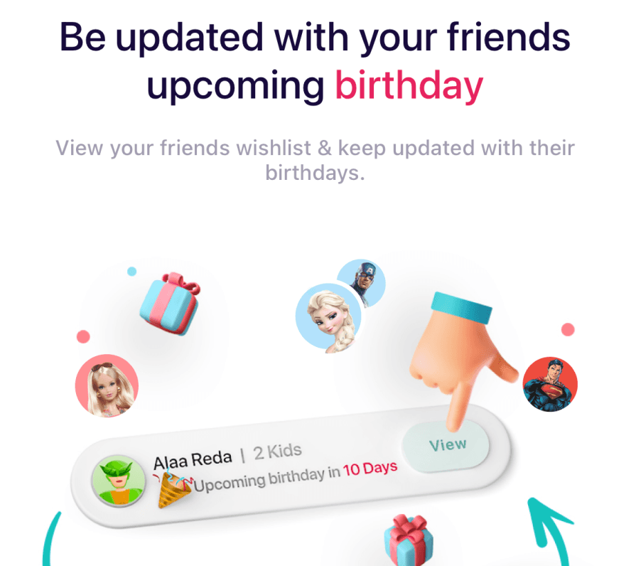
0 Users were able to understand the onboarding
Related to Understandability
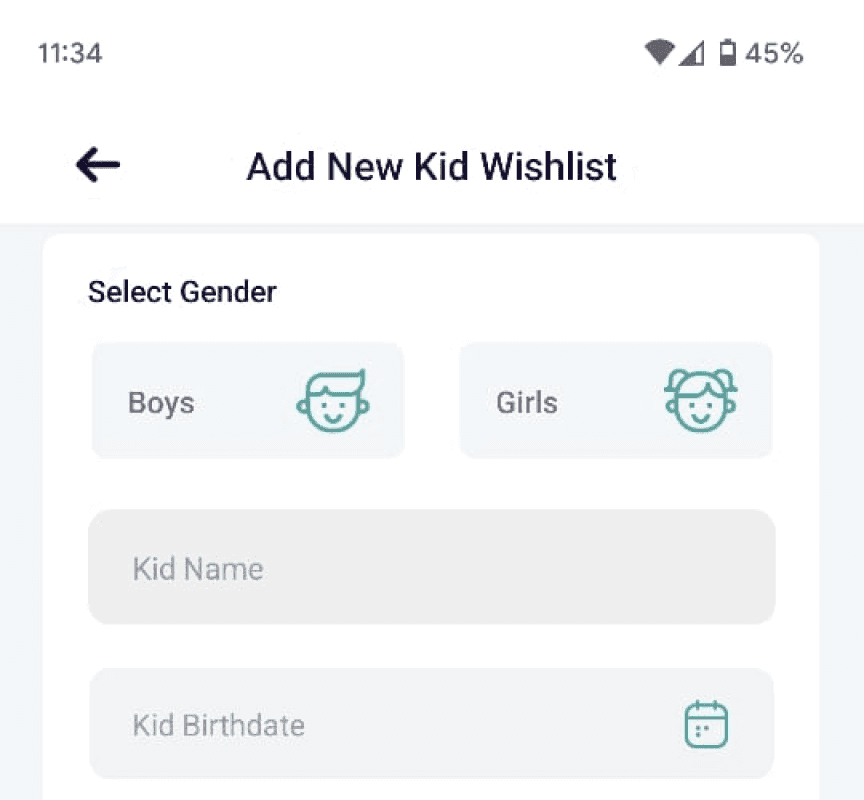
4 out of 5 Users were not able to complete tasks related to the kid’s Wishlist
Related to Task Success Rate
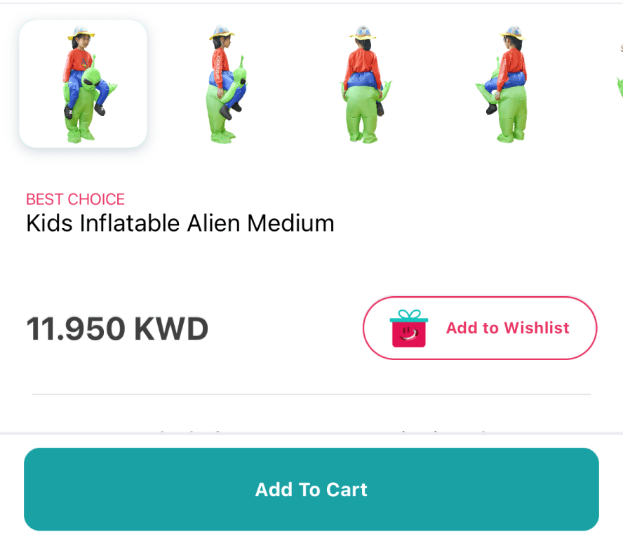
“I feel lost of context to in process of checkout”

“Copy and infographics are mismatch with actual screen while onboarding”

“I am not sure from where can I access the kid’s Wishlist.”

it’s
hard to
understand
I
need help
USER POV
Synthesising the research
I pulled quotes from the interviews and usability tests, coding them into themes, and subsequently utilised these themes to design a sollution.
Gaining Clarity
“How might we increase the discoverability & learnability of send a gift feature, while making the feature simple , delightful and understandable to use.”
Iteration 1
Iteration 2
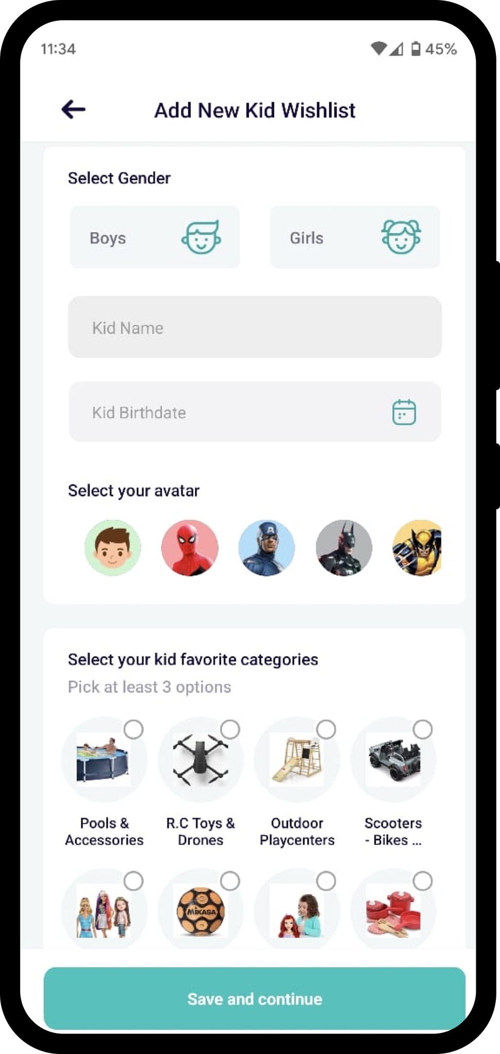
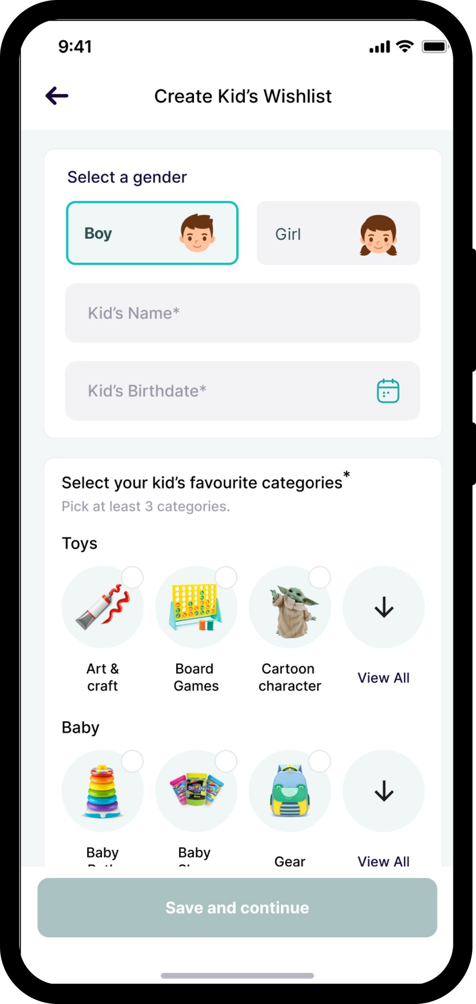
More categories shows
upfront
Eliminated the avatar field as it’s provide
no actual value
No data or Sorting
the speed of finding these tags.
No imp. in picking more relevant tags
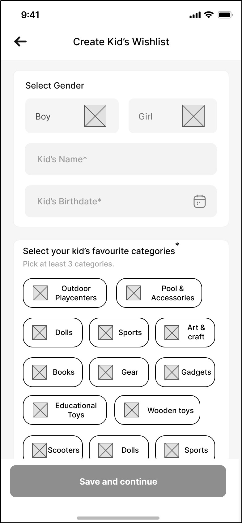
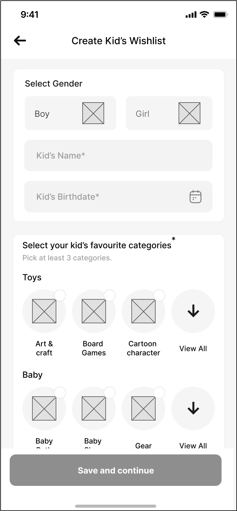
users can scan groups
first quickly
Increase the speed of
finding & selecting
created reasonable size
of groups of categories
Less numbers of category shown.
Create a kid’s Wishlist quickly and
effortlessly.
Screen Goal
Improving the usability of selecting category from a long list and
the error prevention mechanism to ease out the process.
Problem to be solved
Flexibility and efficiency of use
Usability Metrics
Old Design
New Design
Categorised the category
More Efficient way of selecting categories
Reducing the efforts
Preselected default leads to enhance speed to create a wishlist.
& Better error prevention
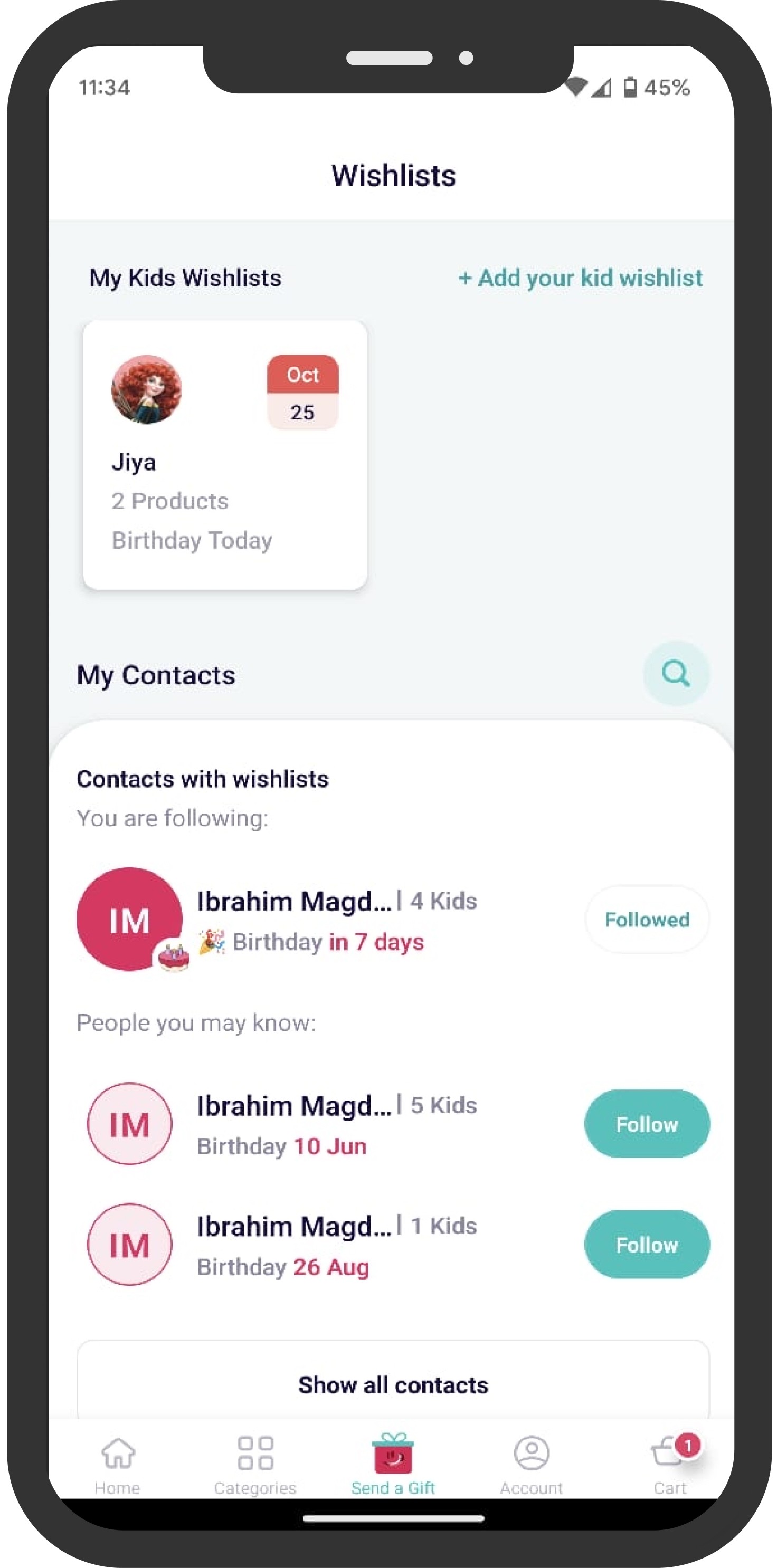
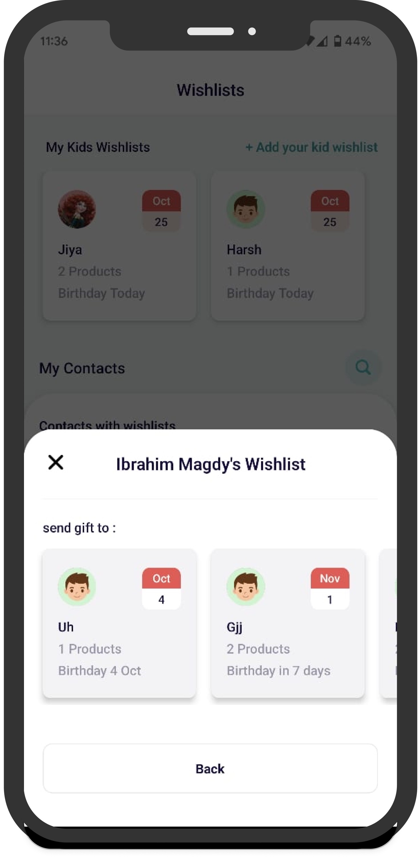
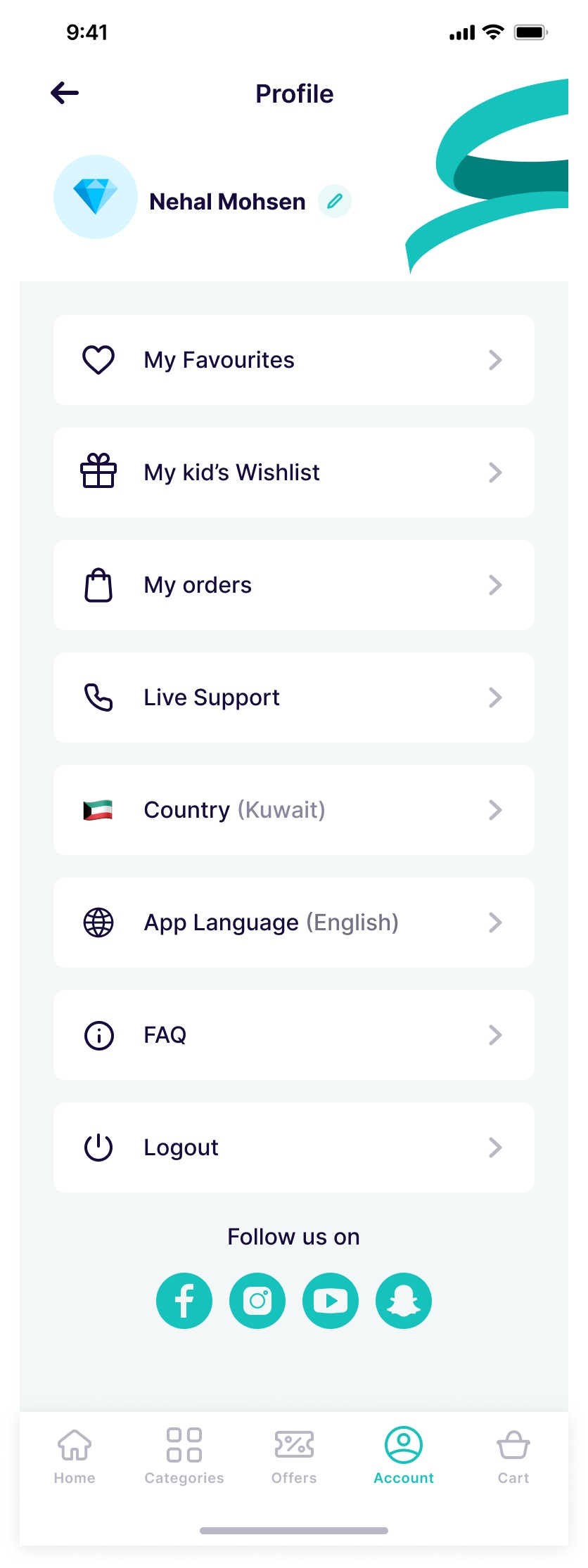
Figuring out Entry Point to increase Findability of kid’s wishlist
I identified 1 entry points on the basis of Research we have added entry point for creating & managing kid’s wishlist in profile section.
Account
Checklists are very effective
for intuitive flows, offer clarity and scope
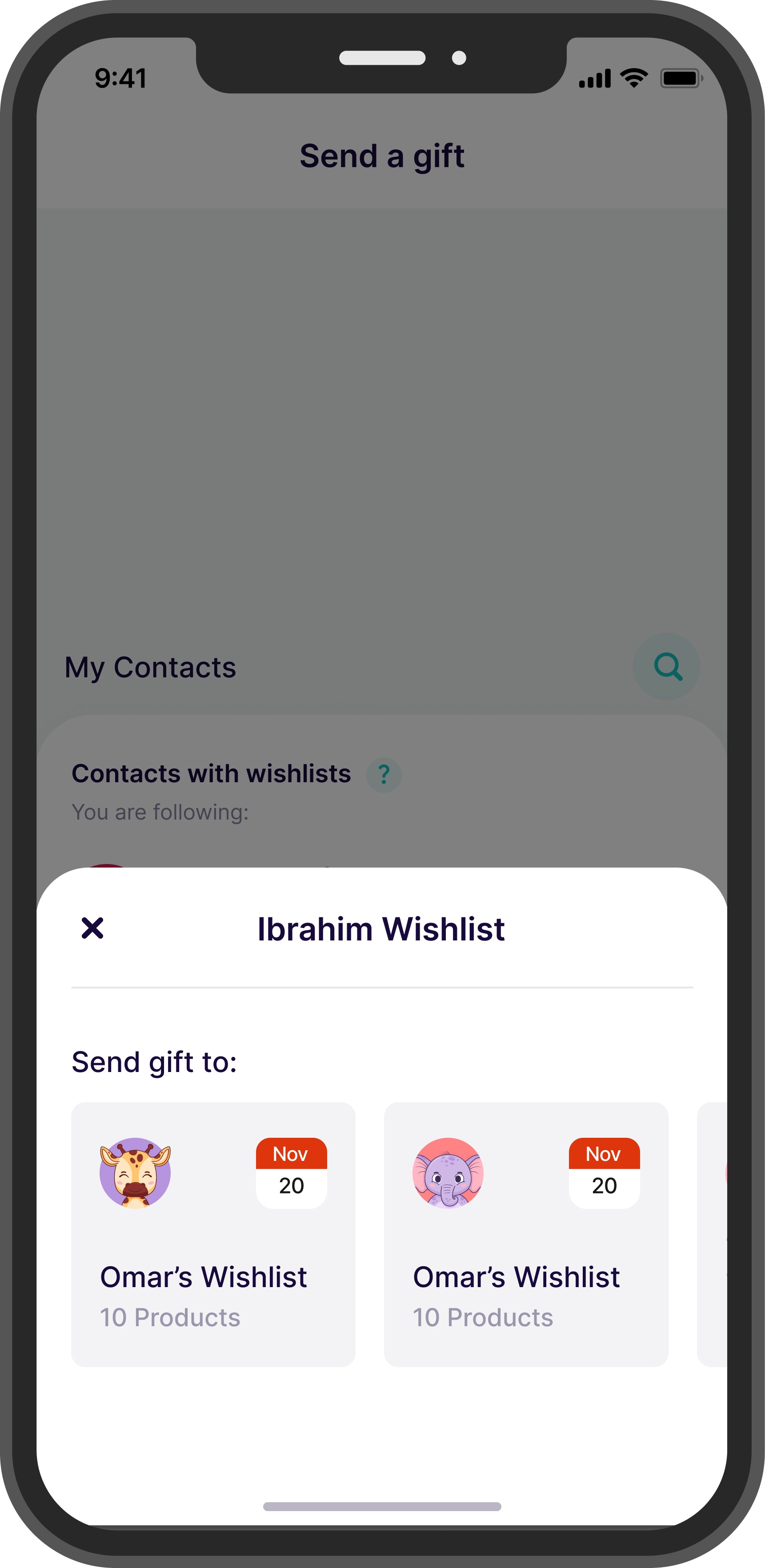
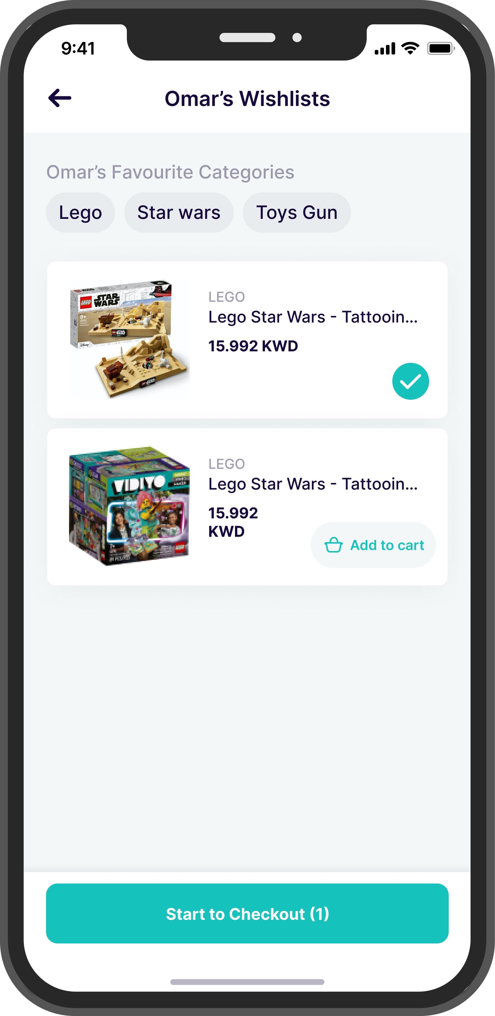
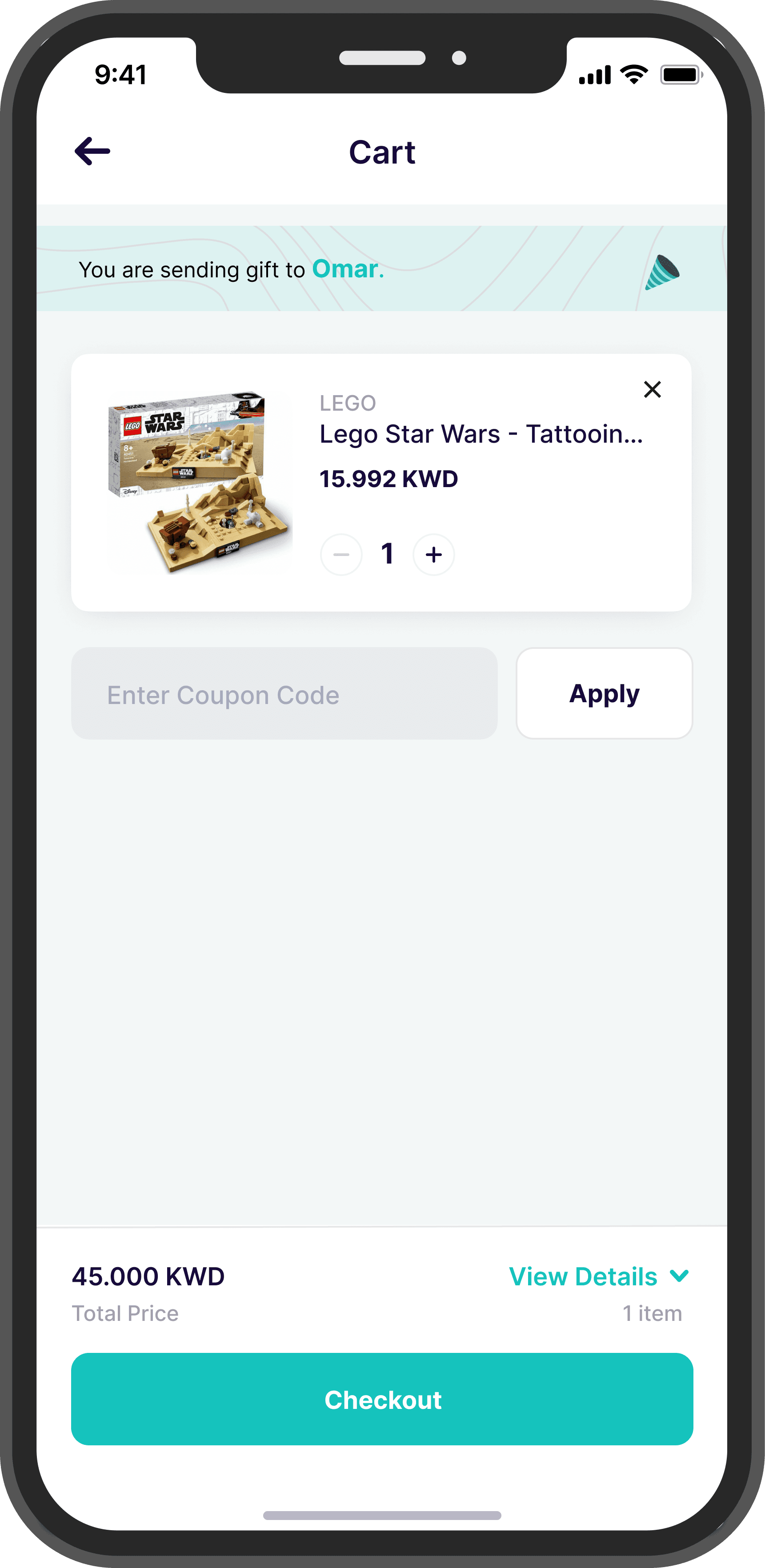
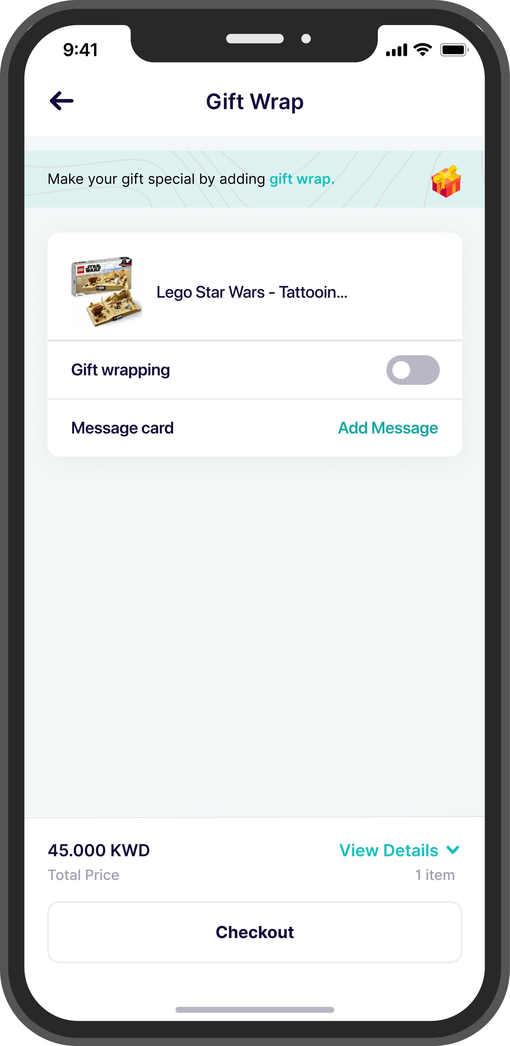
Send a gift
Journey goal
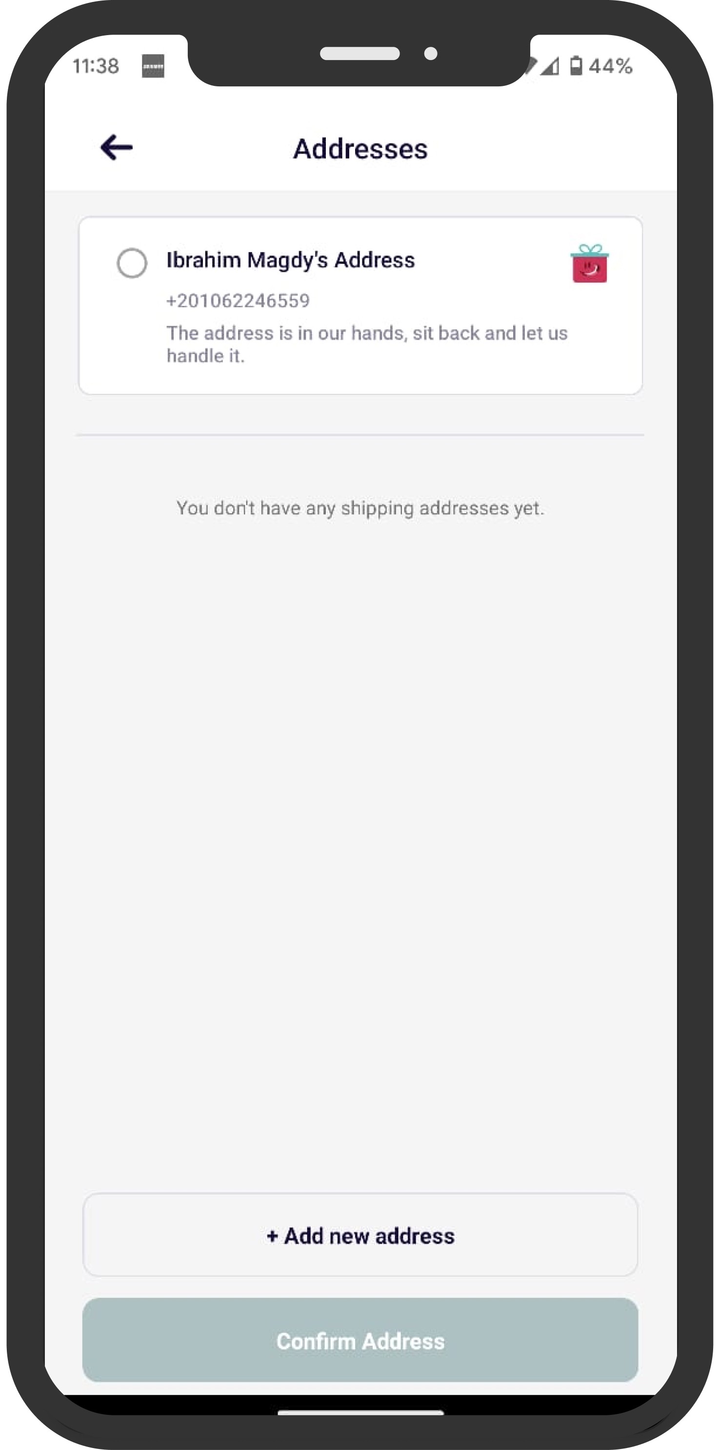
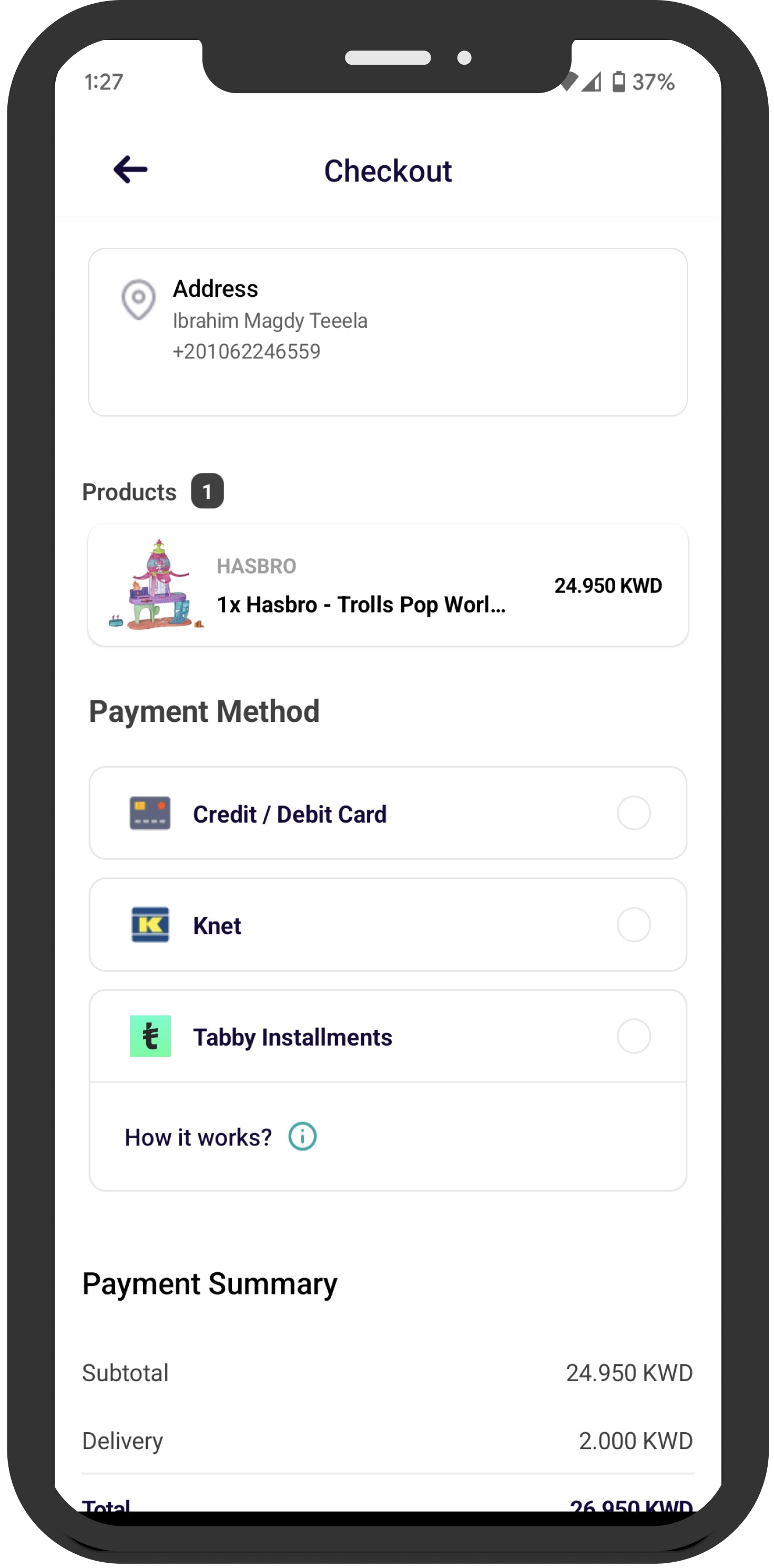
There was lack of cohesiveness in flow and lack of context regarding process.
Problem to be solved
Delightful, Coherent
Design Goals
Design Process
The project had some initial designs when I started working on it. Here’s what my design process looked like:
UNDERSTANDING THE REQUIRMENT
Understanding the Current Experience
Crafting the Research
The Research Results
The focused design brief
Design Ideation
Old Design
New Design
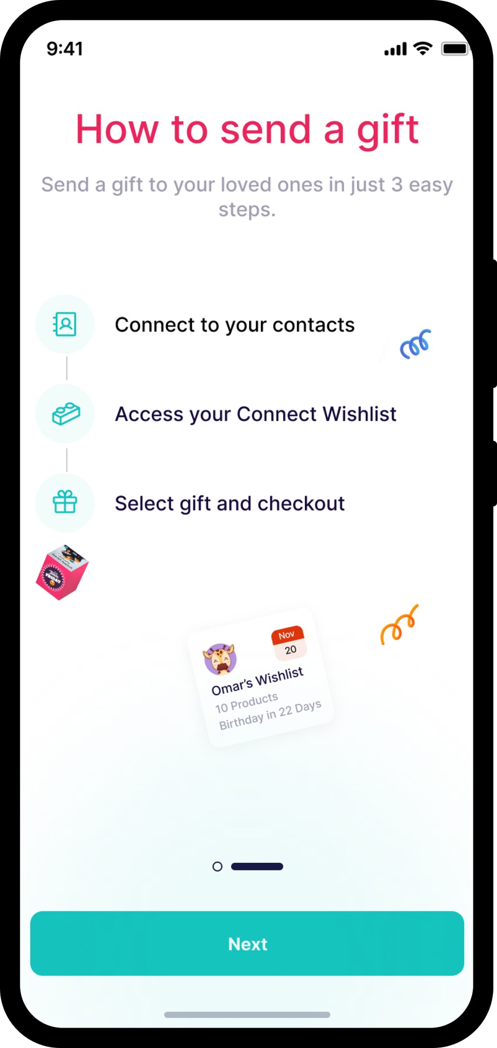
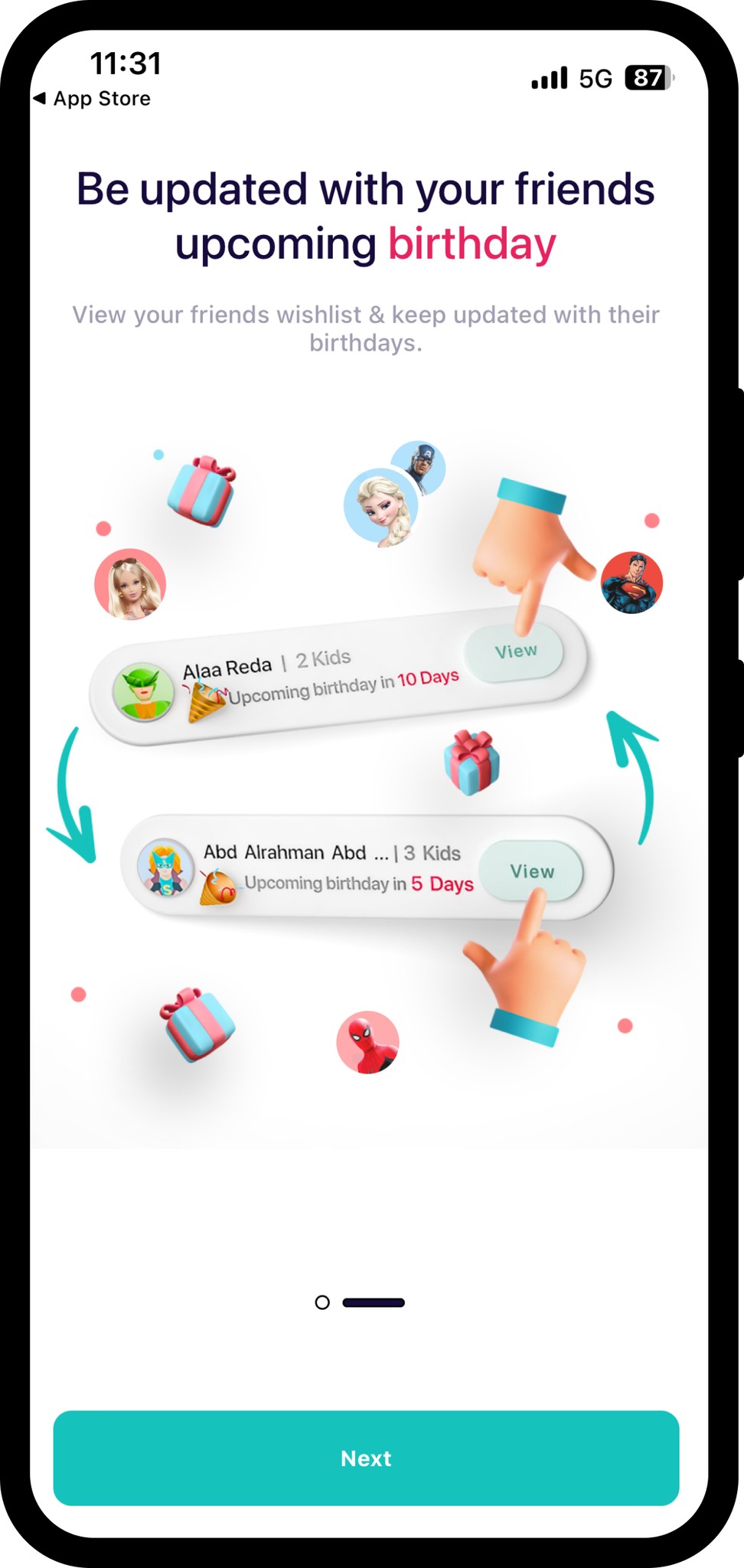
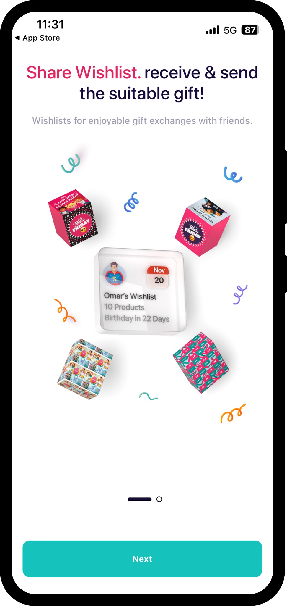
How Might we increase Feature adoption - Strategic solution
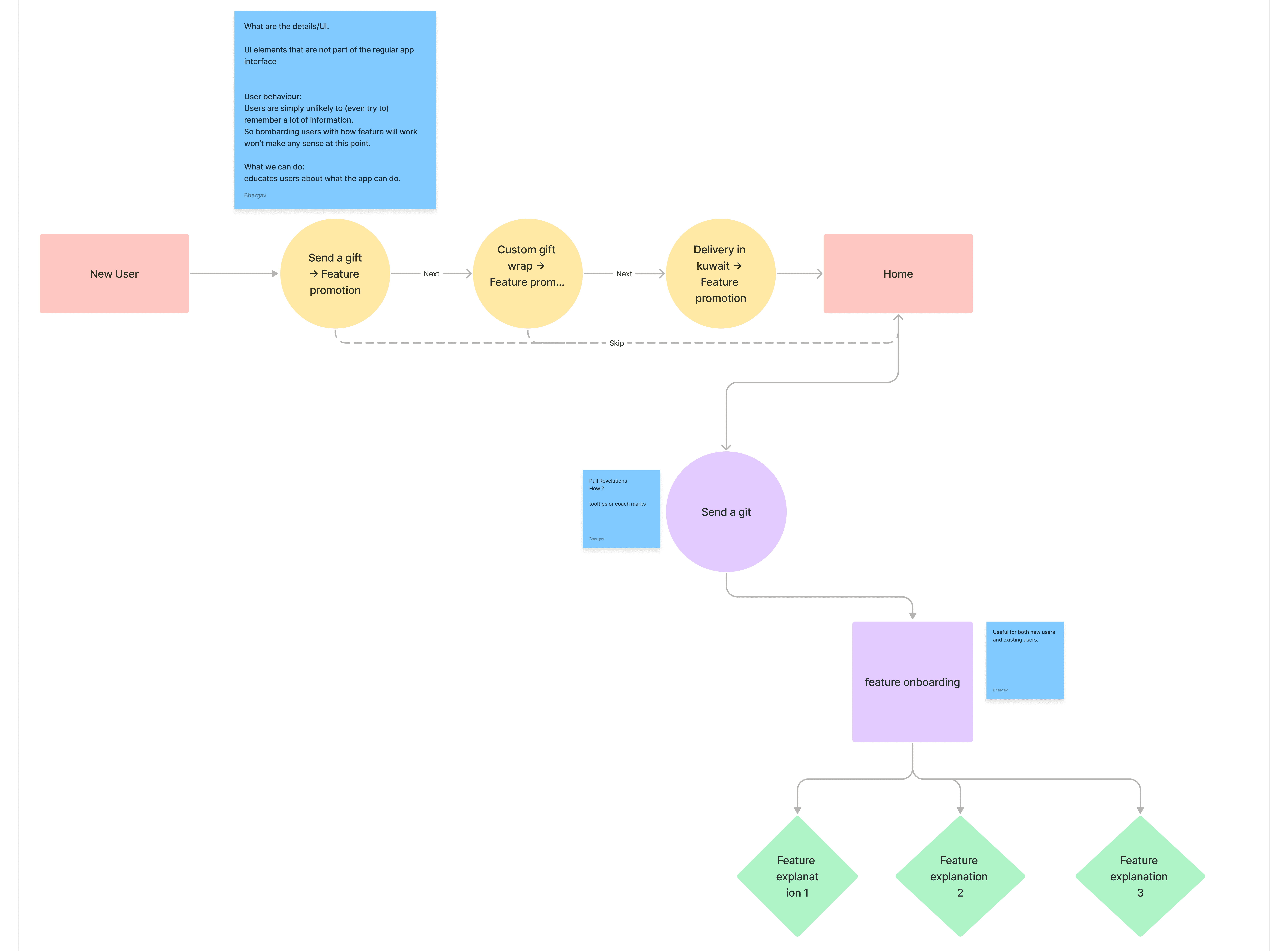
Push revelations reveal new information out of context, without any specific indication that the user
would benefit from the information at that moment.
2nd Step
1st step
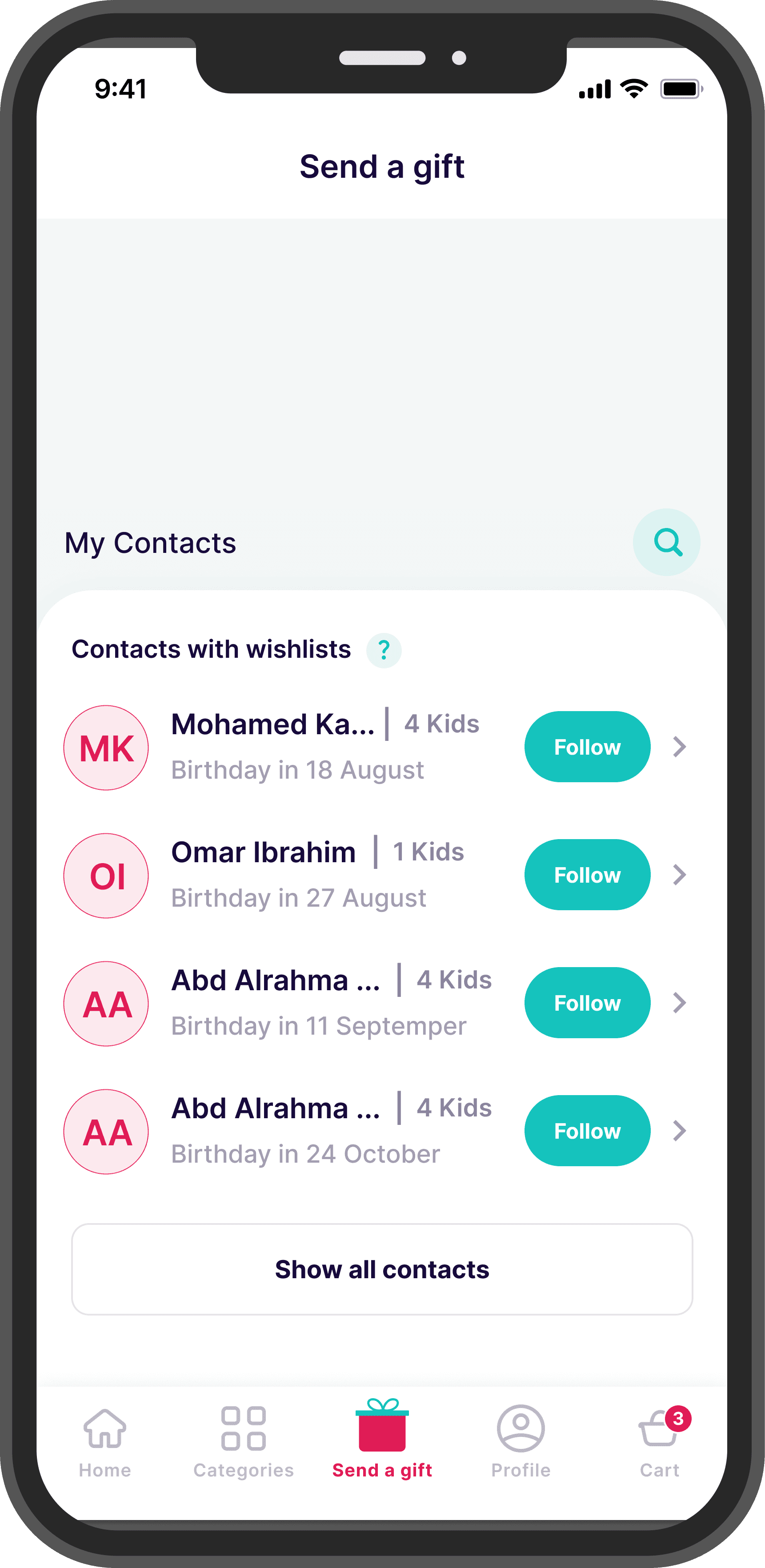
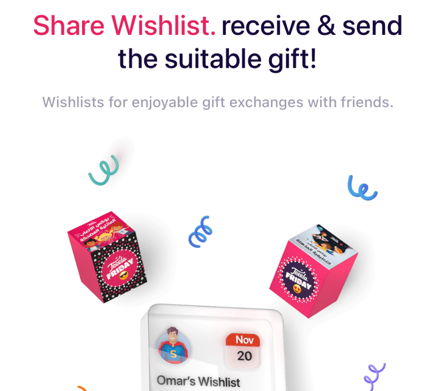
In onboarding screen of “Send a gift” we are pushing users to explore the new feature of send a gift to contact. -> make users aware of new features or changes.
Pull revelations in home screen -> using tooltip /Coach marks. Then once user click we will show actual feature onboarding screen to the users
My Learnings
fin.
Understanding User POV’S
Identify gaps in designs
Understanding
Requirements
Improving I.a.
Delight
Real Change
Improving understandability
Solving problem
Context

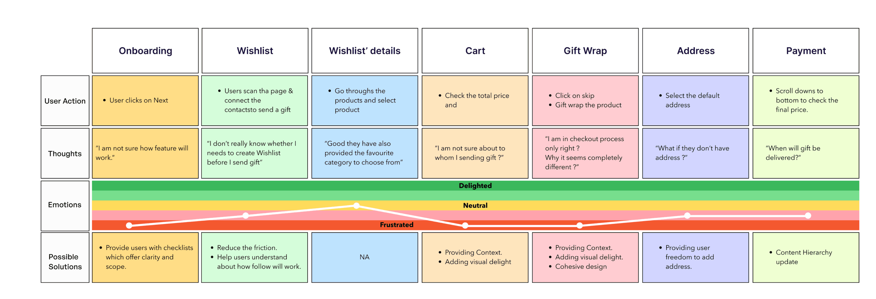
Send a gift user journey
Methods used
Semi-structured interviews and usability tests I chose these research methods to gain deeper qualitative & usability insights from consumers POV.
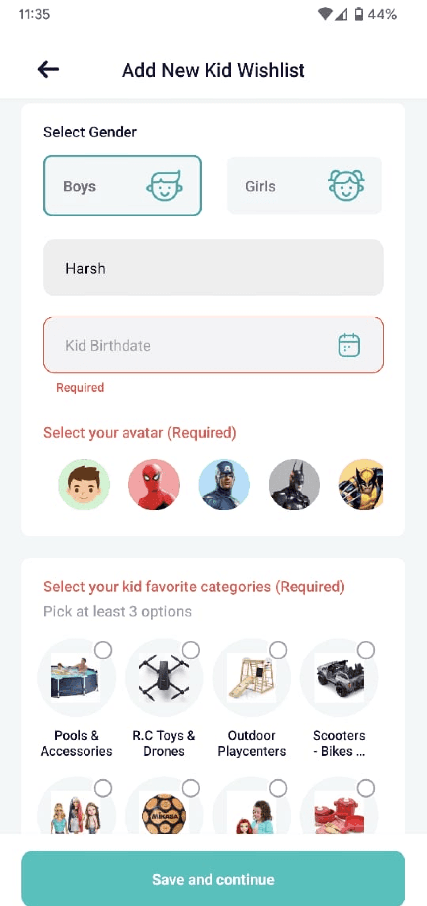
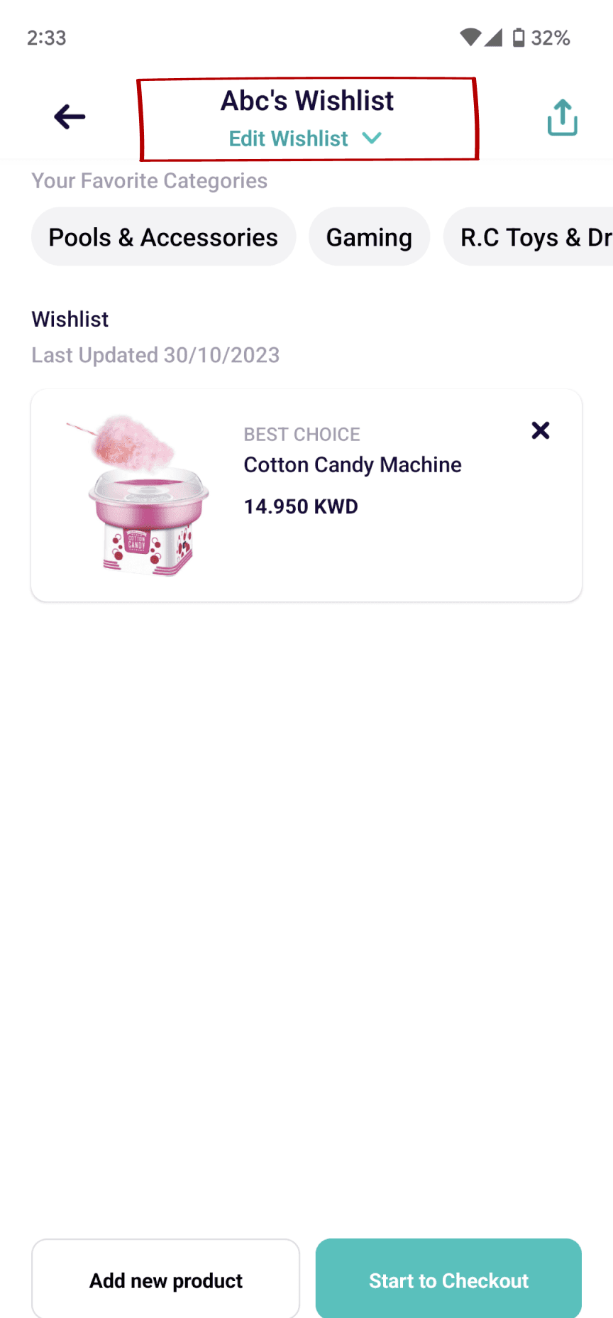
Kid’s Wishlist
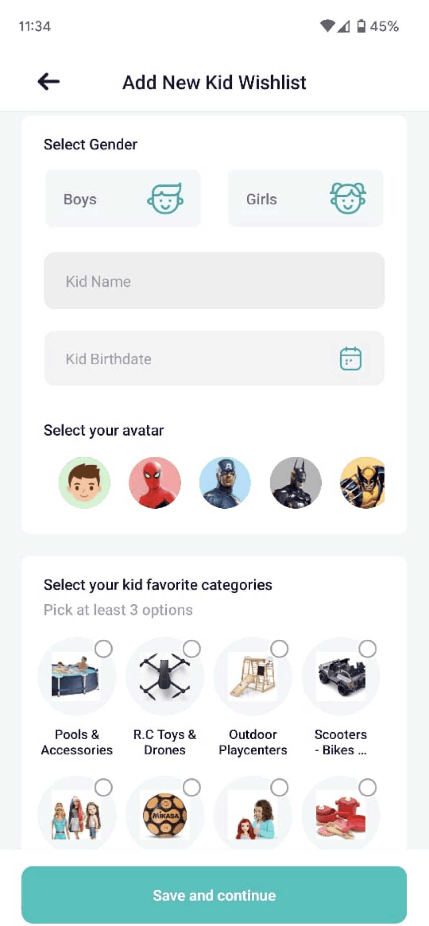
Kid’s Wishlist
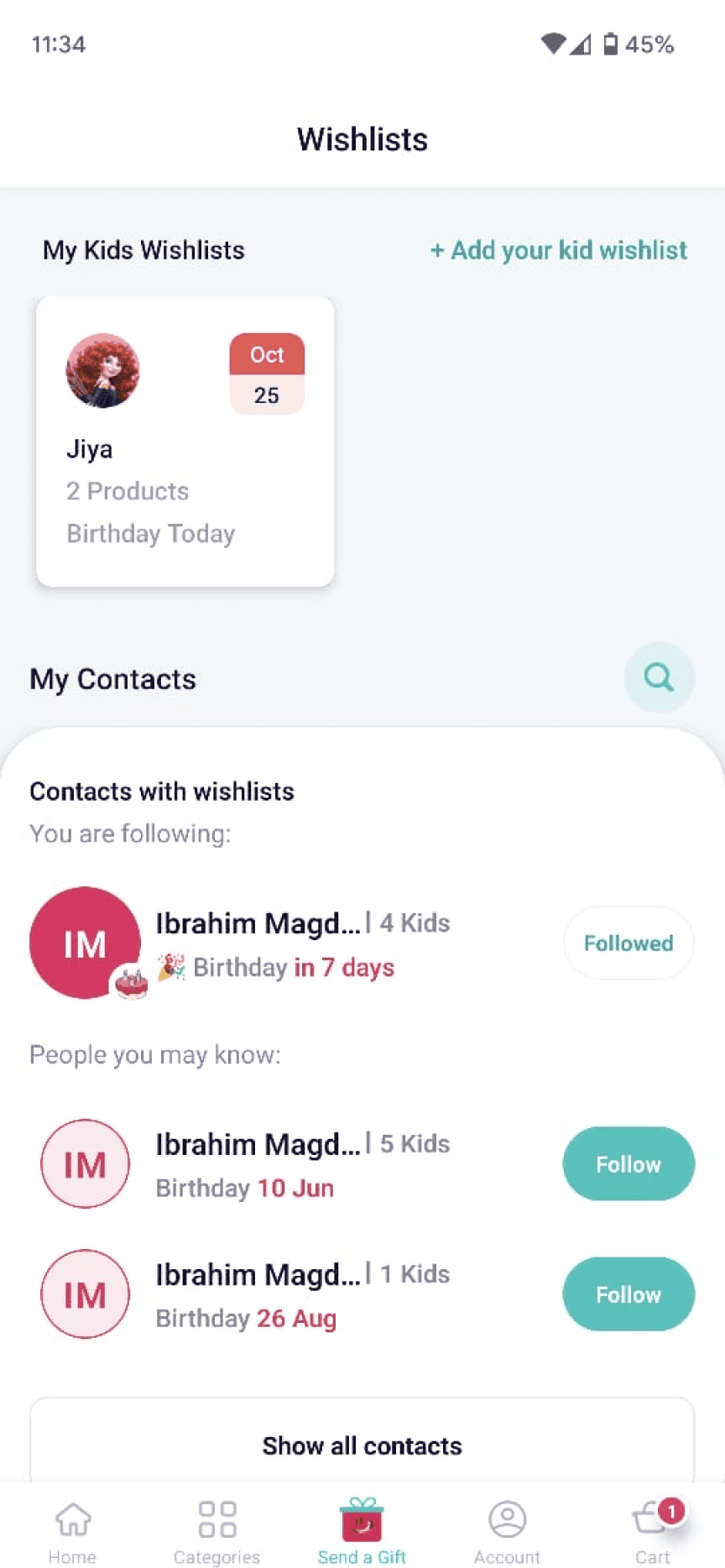
Send a gift
Heuristic Violated:
NN5 Error prevention;
Heuristic Violated:
NN4 Consistency & standard
Heuristic Violated:
NN7 Flexibility and Efficiency of Use
Heuristic Violated:
NN4 Consistency & standard
Kid’s Wishlist
Create flows - User Flows, IA, Swimlanes - to get clarity on how things work at system level.
Getting feedback on quick and dirty designs works great in a fast-paced environment.
Don’t focus on fidelity of designs or getting too attached to an idea - be flexible!
Bring in the engineering early in the process to understand technical constraints.
Aim for North Star but scope down as and when needed.
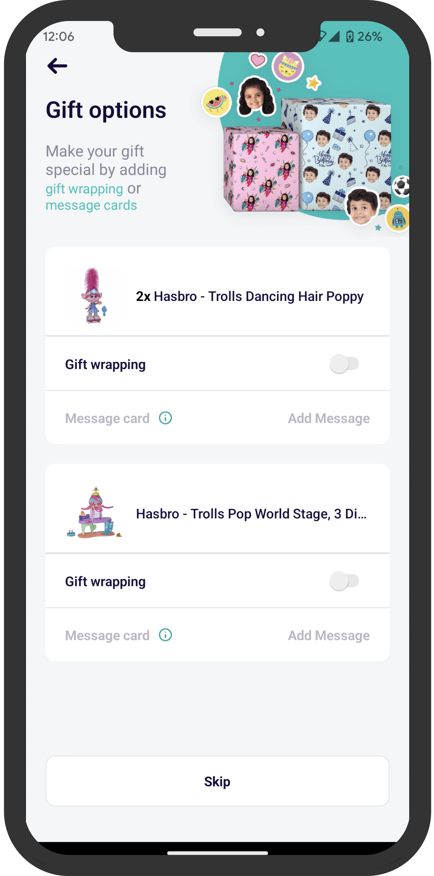
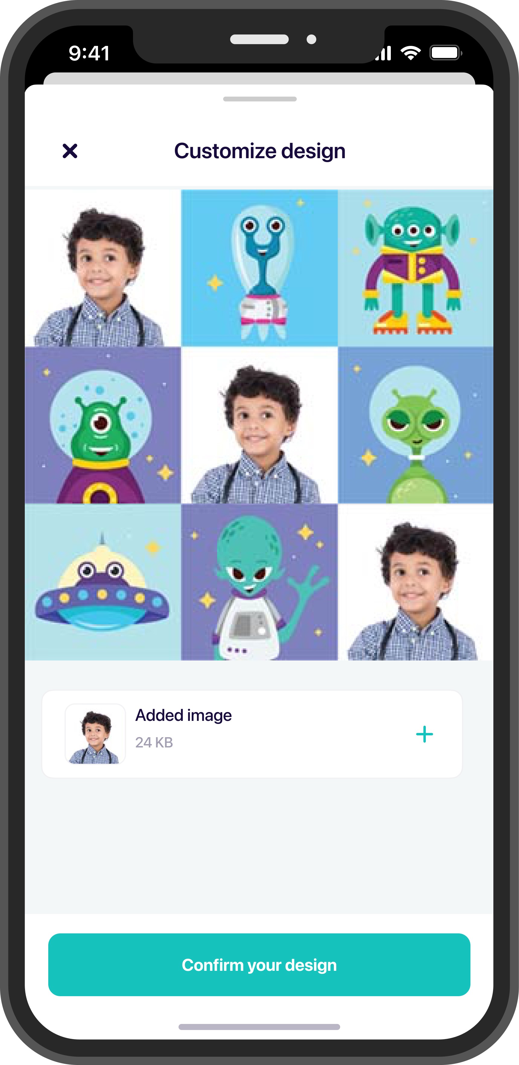
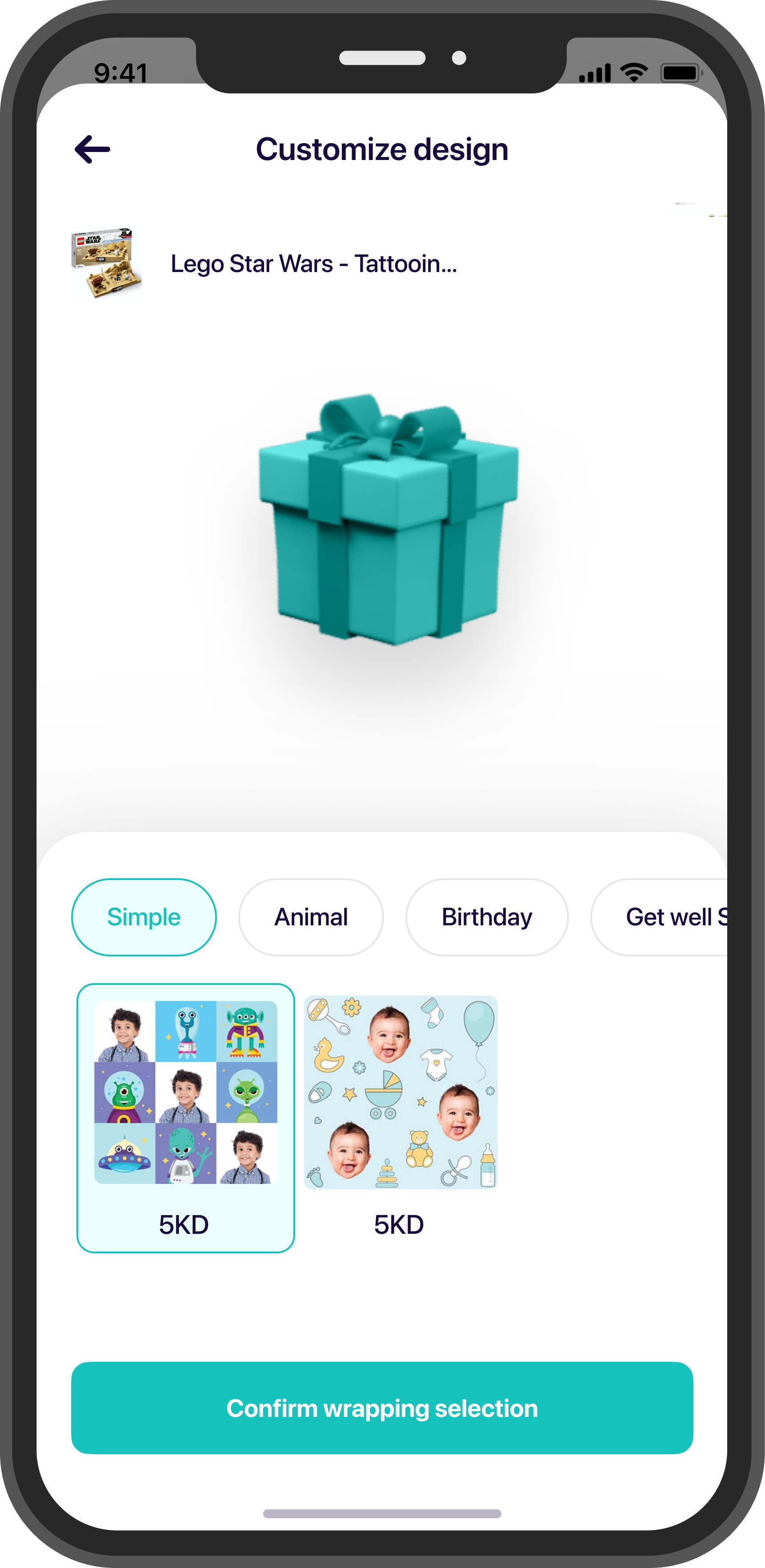
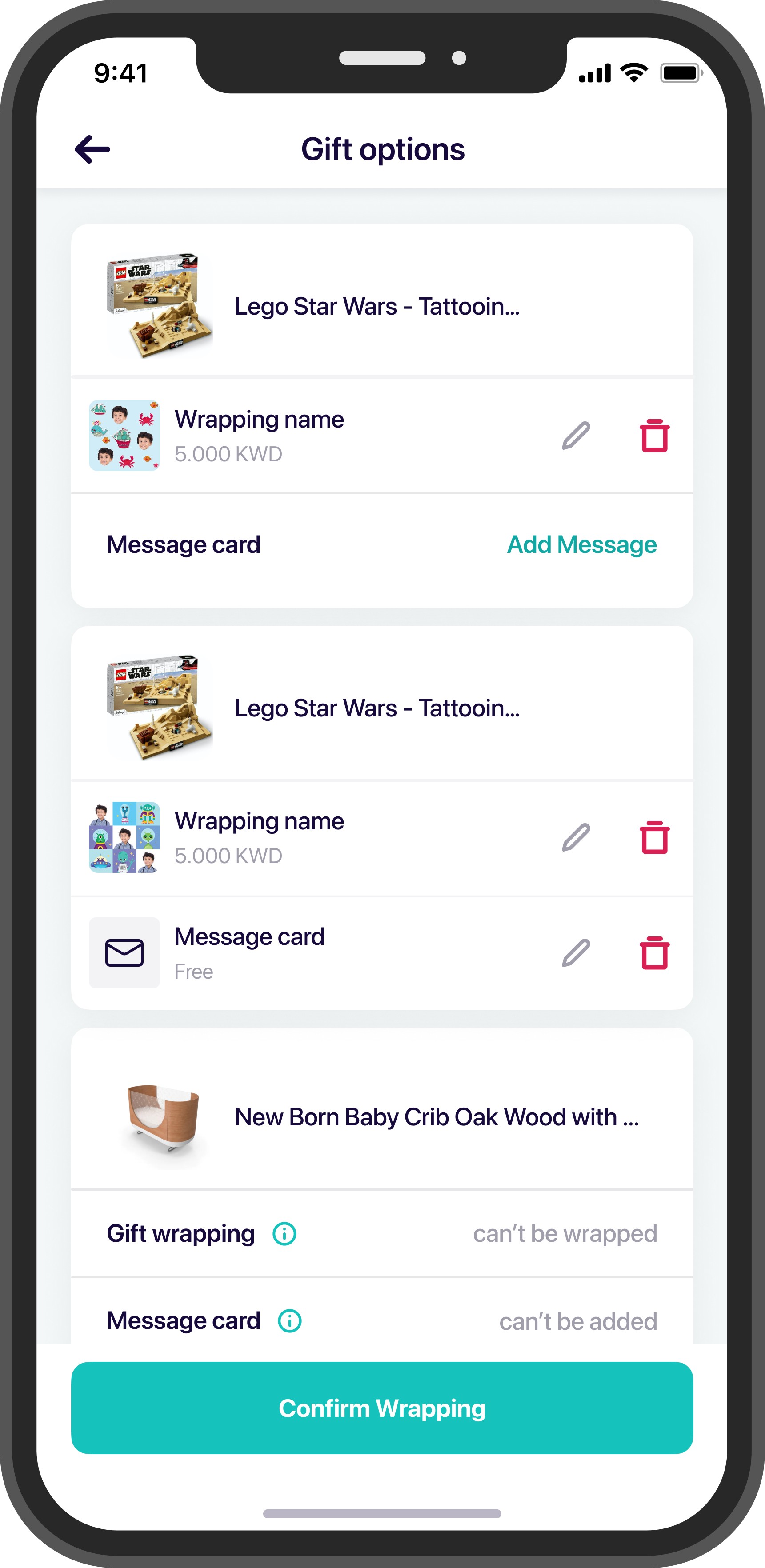
Feature II. DIY GIFT WRAP
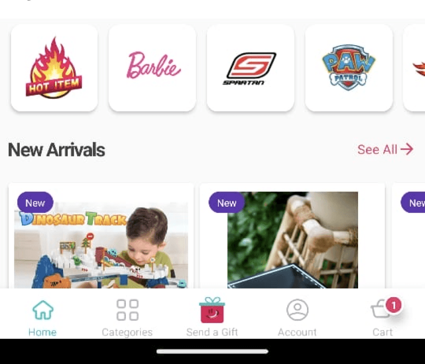
Related to Discoverability
4 out of 5 Users were not able to discover the feature
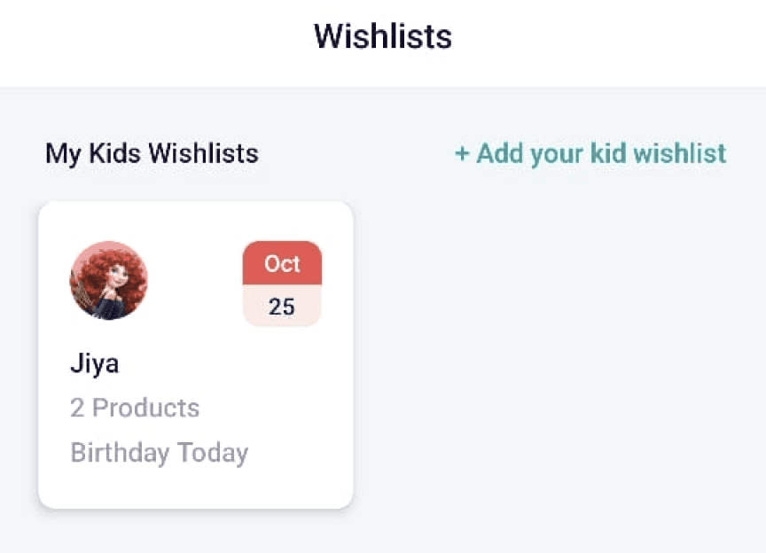
Related to findability
0 Users were able to find kid’s Wishlist
Old Design
New Design
Feature onboarding of new users
Screen Goal
There is an overall poor user activation during feature onboarding. Improving the understandability of the feature by improving clear and concise UX copy and visual elements.
Problem to be solved
comfortable education experience
Metrics
