Resource Management & CRM suits
Enterprise
RMS
Case Study
MRMS is a secure, web-based, fully-hosted application suite customisable to meet internal requirements. The suite includes document archive, HR module, employee modules , customer management, Project management etc
Redesign
Context & Challenge
Process
The Mind-inventory Resource Management System helps managers in allocating resource and technology to a project in accordance with their needs.Together with this portal, there are additional features for sales, HR, and other business verticals including lead management, organisational policies, interview scheduling, etc.The portal has been developed organically by developers, solely focusing on meeting the specific requirements of internal use. However, earlier we have been unable to dedicate sufficient attention to user experience. . It has tiered user levels for employee access to their own data, manager’s access to venue data and senior manager access to all company details.
The main challenge is to enhancing efficiency and user-experience: overcome decision making inefficiency, priorities key information.
Stakeholder allignment
Analysis and priorities
Design
Delivery
Usability
Audit
I kickoff the work with interviewing the stakeholder and PM of the project to understand the long-term and short-term business goals, to gather the existing knowledge about the product and future roadmaps and to understand stakeholders aspirations, fears and hopes from the UX intervention.
Stakeholder alignment
Product goals
Usability audit
Provide a consistent experience across all modules.
The design should offer a robust platform to managers, enabling them to manage and analyse data efficiently.
The revamped user experience should help to reduce the time to complete task and overall experience.
The purpose of this process is to highlight existing usability issues in the MRMS web app and suggest improvements to enhance the app’s functionality from a usability standpoint. The goal is to improve the effectiveness and efficiency of the system.
Summary of the usability and visual audit
Total usability score for the portal was 157 while visual heuristic score was 39. We move forward with prioritised framework which I have introduced while auditing.
1
2
3
4
5
Visibility of
System Status
Match between
System and Real World
Consistency
& Standards
Error
Prevention
Recognition
Rather than Recall
Flexibility &
Efficiency of Use
Help Users Recognize, Diagnose & Recover from Errors
Help &
Documentation
7
9
5
5
50
12
User Control & Freedom
29
21
Aesthetic &
Minimalist Design
19
Usability heuristic Priority scale
5 Urgent
Visual heuristic Priority scale
5 Urgent

16
7
Areas of improvement:
The system as a whole needs to strengthen its error prevention mechanisms.
Platform could perform significantly better if consistency and standards were upheld.
The user may need to make fewer decisions on each screen if the right architecture in place.
What went well:
Users can easily navigate to different sections without any ambiguity.
Clutter-free design was made possible by using a simple and minimalistic approach.
The purpose of the Reports screen provide a holistic view of day to day operation of organisation, this screen is most used by the team leads, Stakeholders, and HR department.

Old Interface
Current State
Final Solution
Breaking down the information.
Total of 14 different reports are being showed in reports page. so I have decided to group reports based on business vertical.
New Interface
Reports Screen
Design Decision 1: Report Screen
Notice Period Reports
Attendance Reports
Checkin Report
Leave Reports
Attendance Regularisation Report
Project Reports
Milestone Reports
Hirebase Reports
Bucket Reports
Allocation Reports
Log Reports
Interview Reports
Performance Report
Lead Reports
HR Report
HR Report
Notice Period Reports
Attendance Reports
Checkin Report
Leave Reports
Attendance Regularisation Report
Resource Report
Allocation Reports
Log Reports
Interview Reports
Performance Report
CRM Reports
Lead Reports
Project Reports
Milestone Reports
Hirebase Reports
Bucket Reports
Project Report
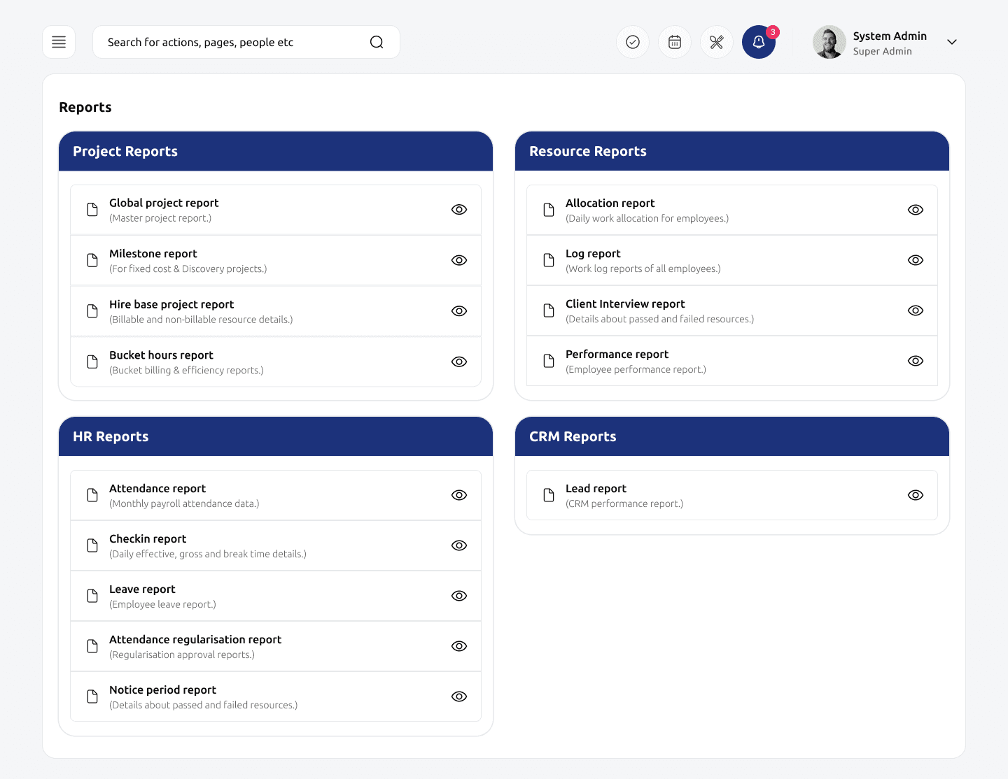

Problem solved
Identify relevant report through logical grouping
, ensuring quick decision making.
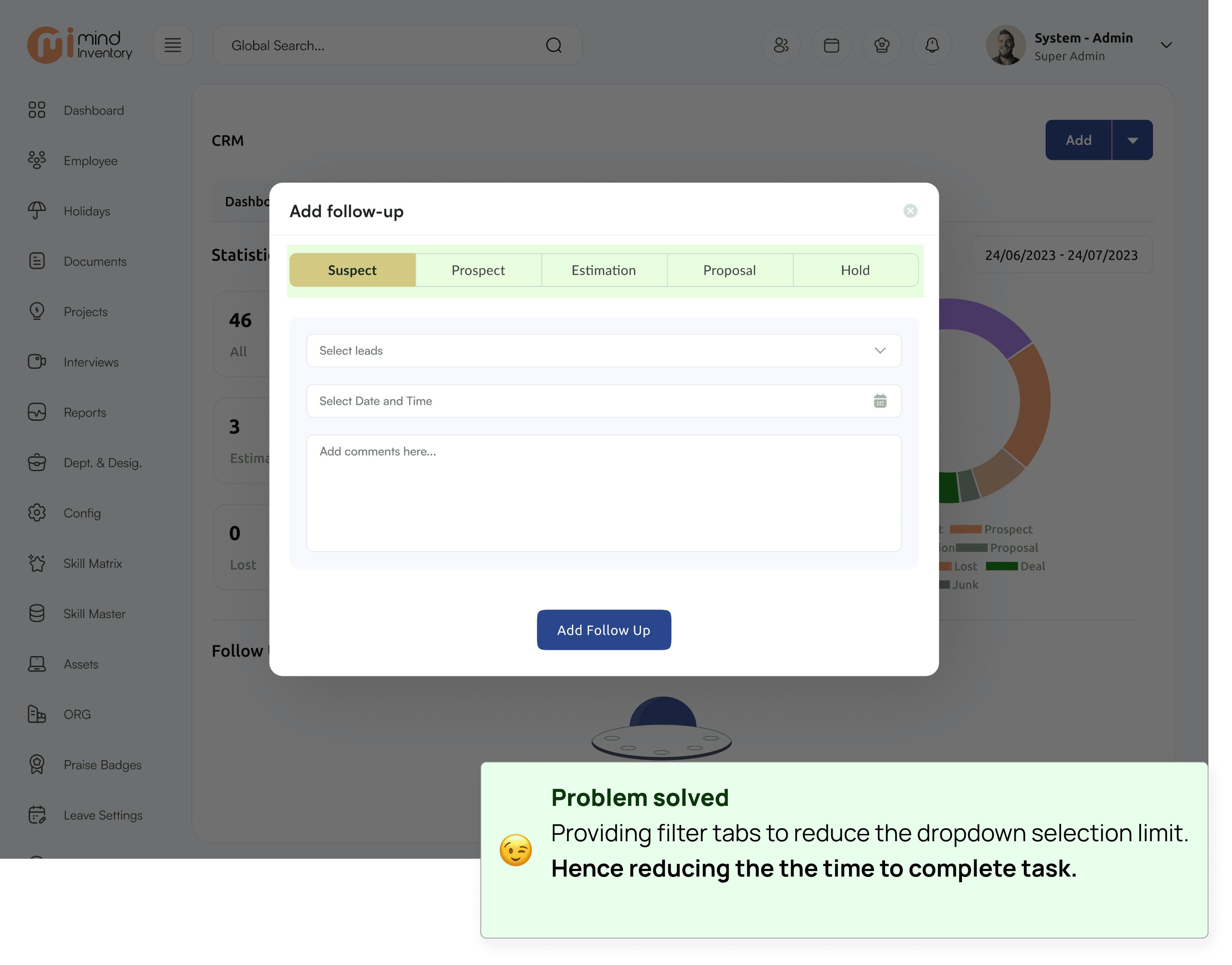
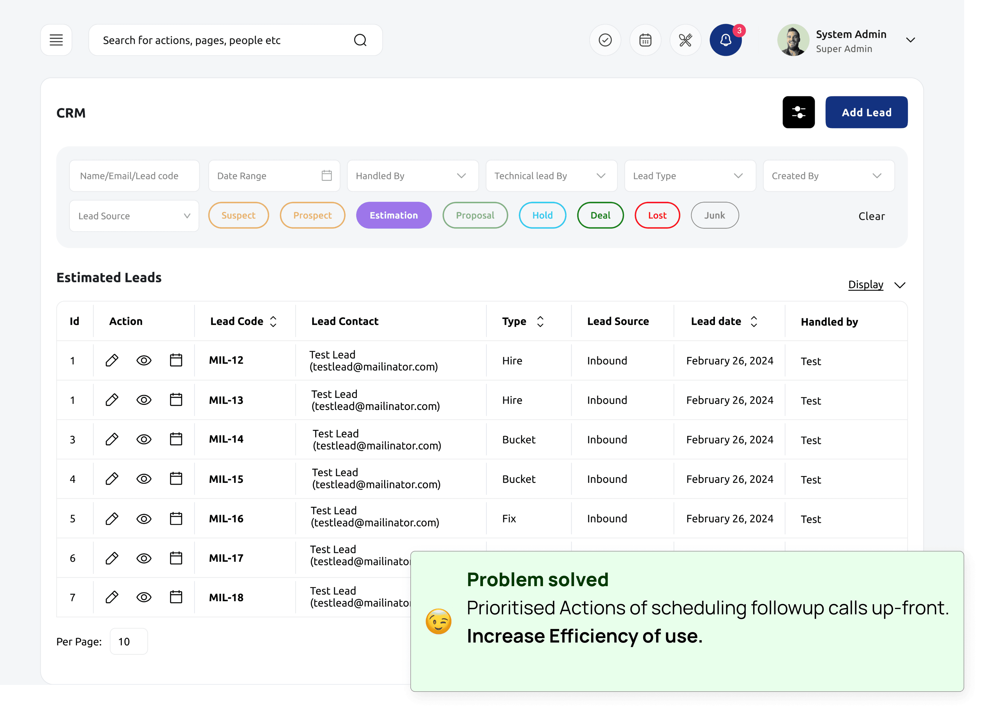
Currently, a product isn’t optimised for sales team, resulting in hacky workarounds and inefficient workflows.We wanted to ship fast, so I lowered the engineering lift by balancing existing patterns and net-new designs. I worked with engineers to find and apply existing patterns in the new context, one of the results was the reducing the efforts of scheduling follow-ups for the sales team.
CRM
Design Decision 2: CRM/Follow-Up Experience
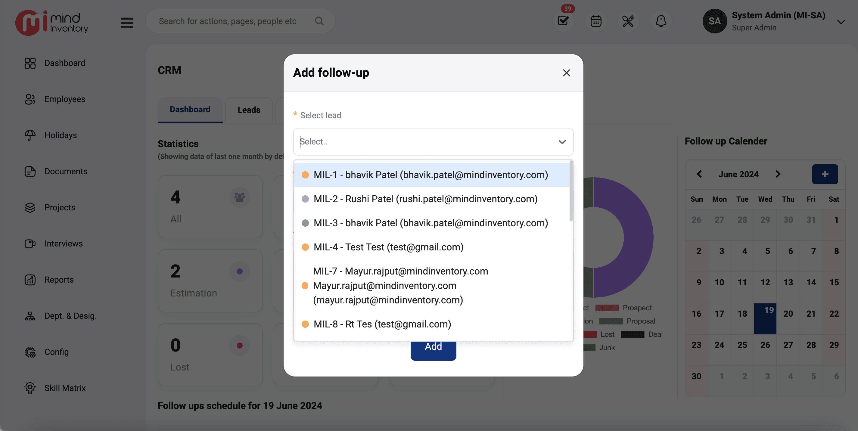

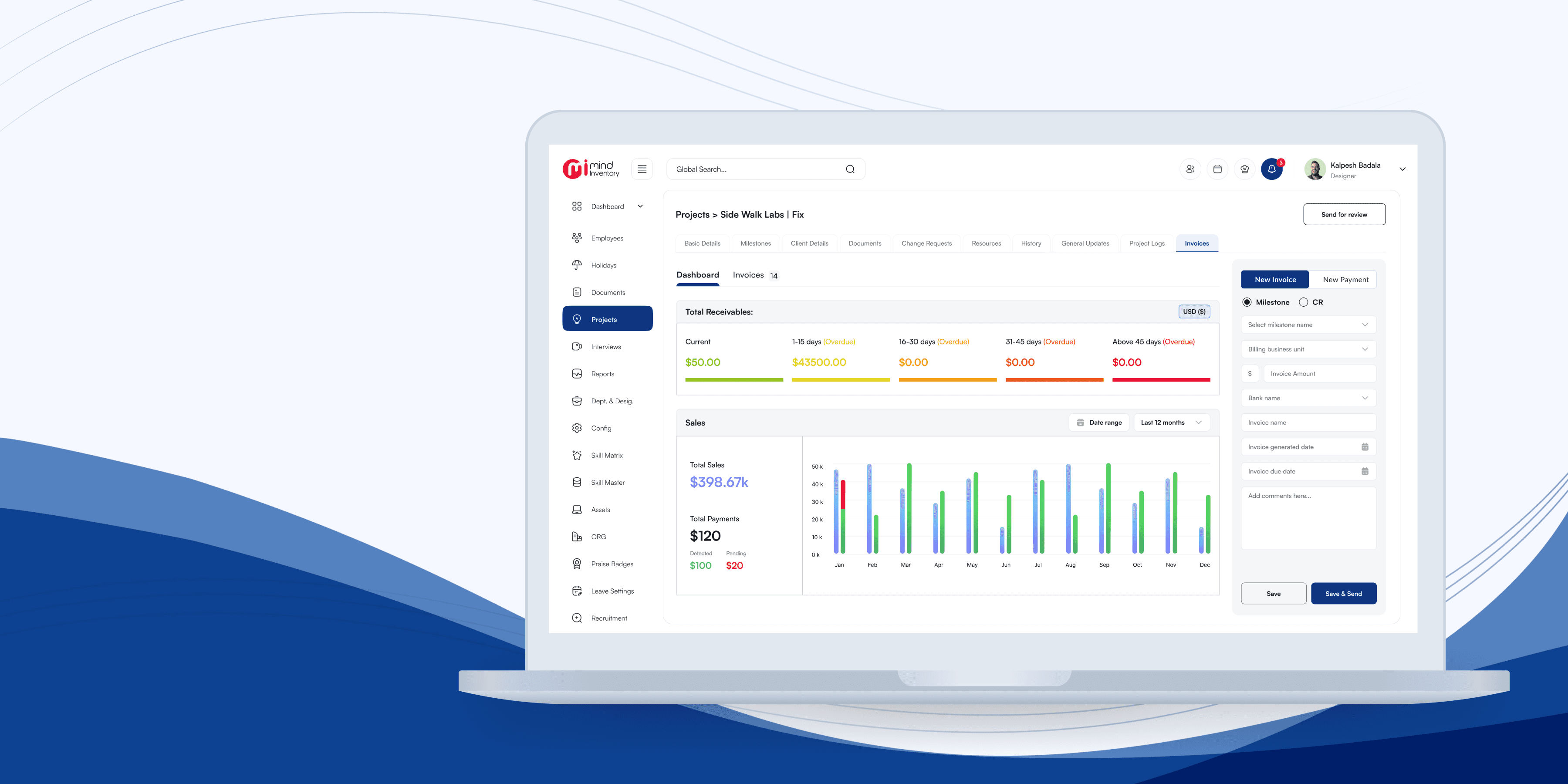
Scheduling follow-up process lakes efficiency in searching

Old Interface for setting up Followup
A complicated searching/selecting experience increase time to
complete the tasks
Actionable CTA of scheduling follow-ups call in lead details screen is hidden deep within another layer.

Workflows
Workflow Optimisation
Total of 14 different reports are being showed in reports page. so I have decided to group reports based on business vertical.
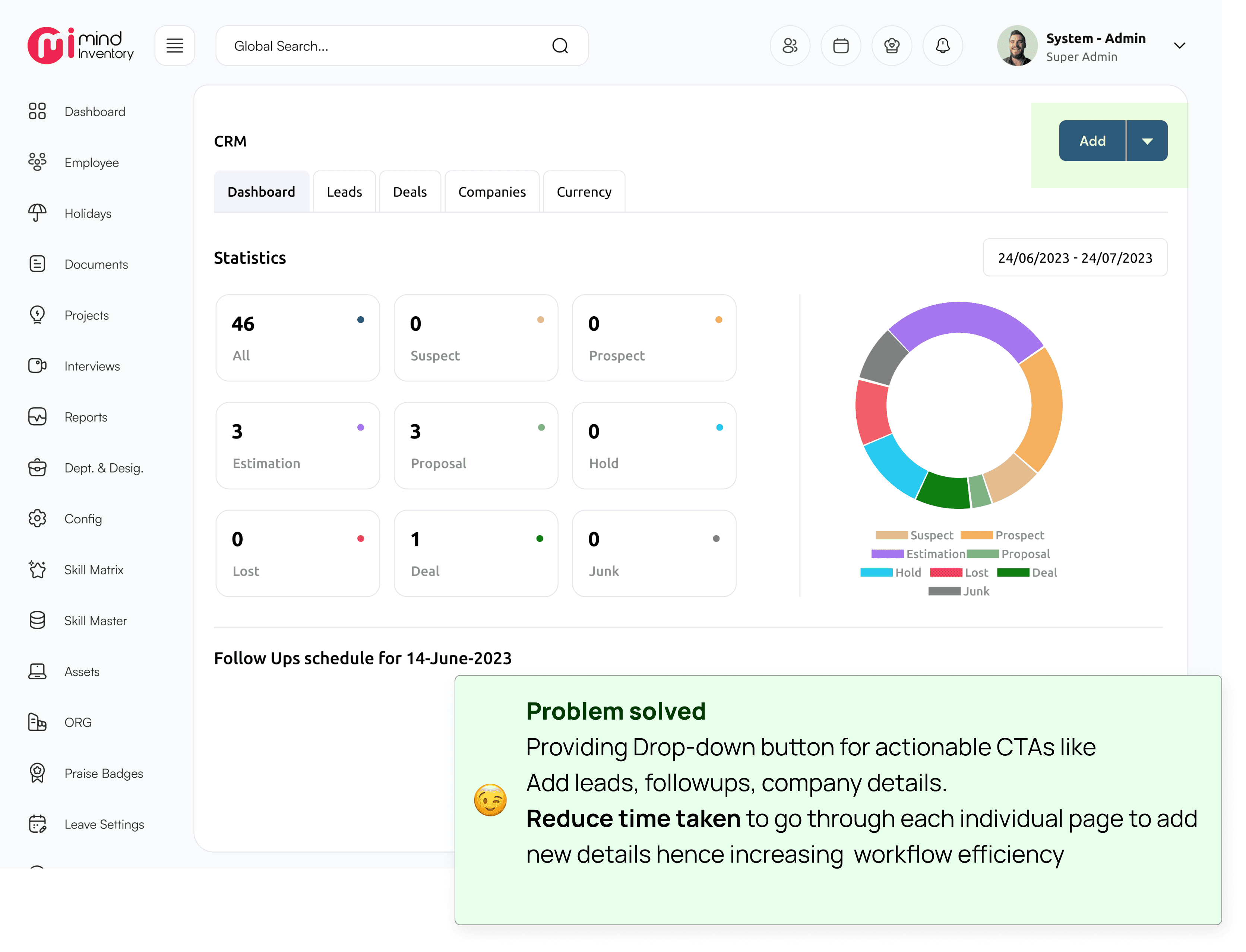
New Interface
Influenced project roadmap
1
Reduce the task time completion rate
2
Pivot direction based on research
3
Outcomes
It’s really important to understand the context in which we apply existing patterns. Since there was a lot of content on every screen ensuring good information architecture was little harder than I expected. But in the end with a lot of iterations and feedback, I was able to pull it off. If proper time and resource has been allocated design system level changes I would further more wish to incorporate.
Retrospect
Thank you for Reading
🙃
This case study is part of a larger project. Above is the documented some key design decision which is highly impactful from the
business & user perspective.
work